TL;DR
Brewing a better way to order coffee online
I reimagined Bayt Al Mocha’s online store from research to prototype, solo, to make it easier to use, more accessible and a lot more like the brand it represents.
THE PROBLEM
Ordering good coffee shouldn’t feel like hunting for it.
Bayt Al Mocha sells specialty coffee with roots in Yemen’s historic coffee port, and that warmth and heritage is the whole point. But the website didn’t show any of it. The layouts were inconsistent, the type was tiny, and the brand’s blue and yellow were hard to find.
My goal: a site that feels as rich as the coffee, and an ordering experience that finally makes sense.
Three questions I kept coming back to
Smoother checkout
How might I streamline checkout so there’s less friction and more completed orders?
Consistent and accessible
How might I keep the look consistent and accessible on both desktop and mobile?
Easy to find
How might I make it simple to find your favorite coffee blend?
RESEARCH & DISCOVERY
First, I audited the site. (It wasn’t pretty.)
I started with a usability audit and a heuristic evaluation to find out exactly where people would get stuck. Five things kept showing up:
Off-brand
The blue and yellow barely showed up.
Inconsistent layouts
Every page looked a little different.
Tiny type
Small text that was hard to read.
No categories
The menu wasn’t organized at all.
Tabs everywhere
Every section opened in a new tab.
KEY INSIGHT
People wanted a consistent, good-looking site with clear navigation and categories that reflect Bayt Al Mocha’s story-driven brand.
WHO I DESIGNED FOR
Meet Amina.
Meet the person I kept in mind for every screen.
About the user
Amina is a busy college student who relies on coffee to get through long days of classes, studying and social activities. She frequently orders coffee online between classes and prefers quick, reliable and visually clear ordering experiences. She values speed, convenience and being able to customize her drink easily before picking it up on the way to class.
Behaviors
- On-the-go student and frequent coffee drinker
- Orders online from her phone between classes
- Scans menus quickly for favorite drinks or seasonal specials
- Prefers clear photos and concise descriptions before ordering
- Gets frustrated by slow or confusing checkout processes
Pain points
- “I can’t tell what each drink is without pictures.”
- “The menu feels unorganized. I don’t know where to start.”
- “Customization is confusing and takes too long.”
- “Everything looks the same. I wish it matched the brand better.”
- Overall: ordering feels cluttered and time-consuming, which doesn’t fit her fast-paced student lifestyle.
Needs & goals
- Quickly find drinks by category (Hot Drinks, Cold Drinks, Refreshers)
- See appealing photos and short descriptions to make fast decisions
- Easily customize drinks (milk, syrup, size) without confusion
- Order ahead and check out with minimal steps
- Have a smooth mobile experience that feels consistent and trustworthy
Technical profile
- Devices: desktop/laptop (primary), smartphone (secondary)
- Internet usage: high (streaming, research, shopping, food apps)
- Tech savvy: comfortable with online ordering but expects standard UX patterns (categories, search, recommendations)
THE VISION
A site that feels as warm as the coffee.
I wanted the redesign to feel elegant, authentic and genuinely easy to use: better brand storytelling, a menu that’s actually organized, and a checkout that gets out of your way. I started with wireframes to map every screen, then built a design system around the brand’s colors, type, buttons and components.
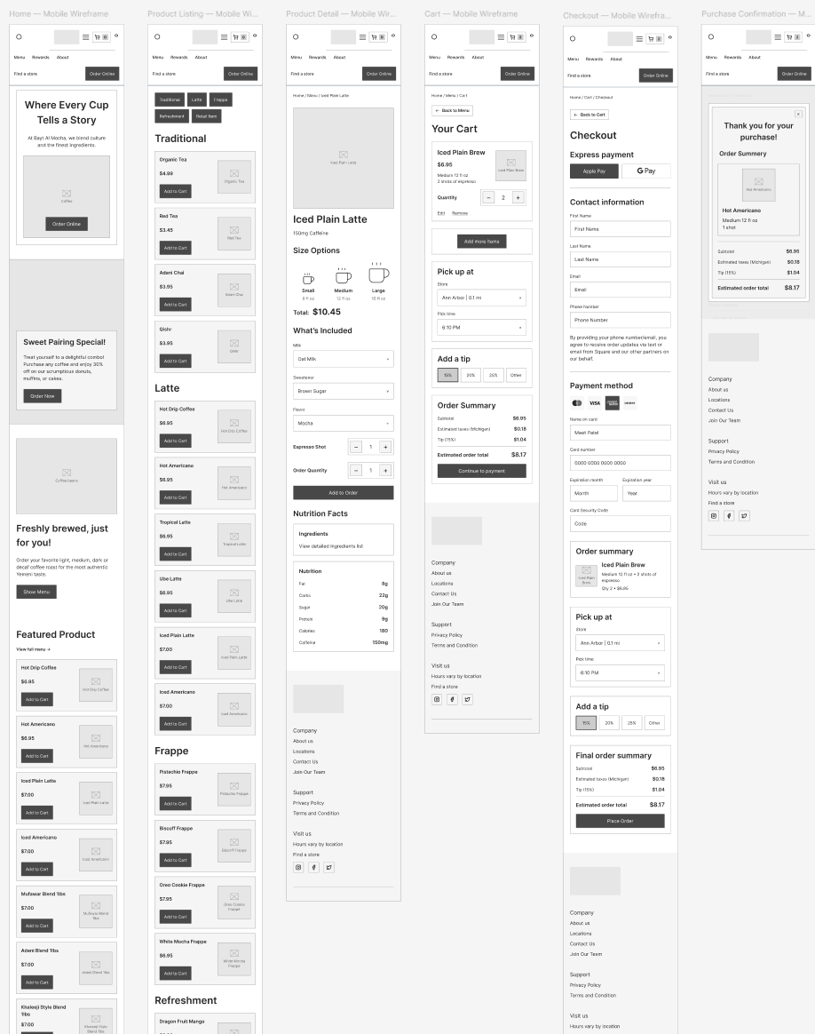
Mobile wireframes: home, product listing, product detail, cart, checkout and confirmation. Click to view full size.
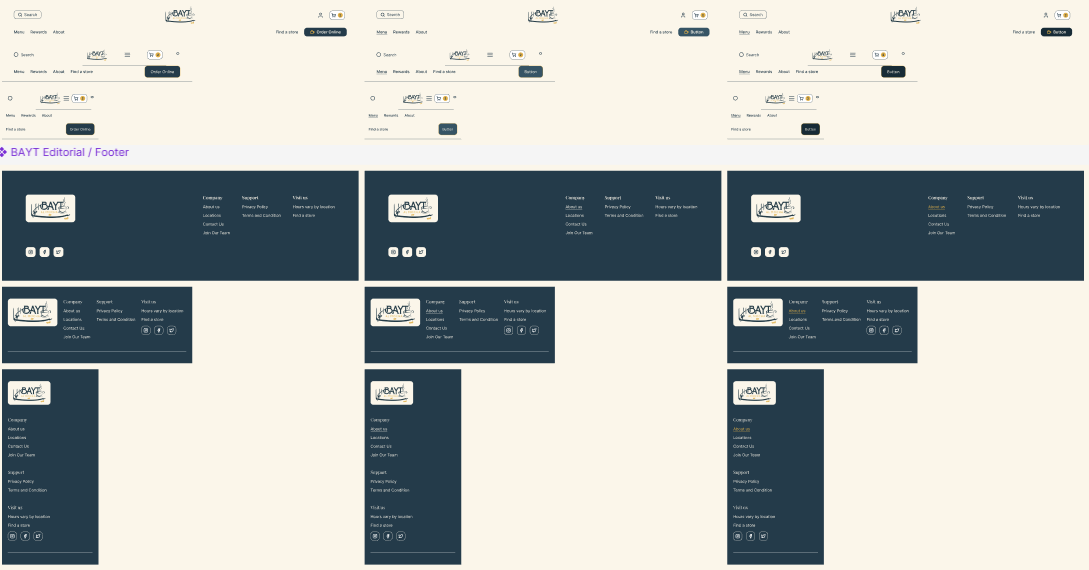
Header and footer components across desktop, tablet and mobile. Click to view full size.
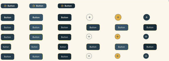
Button components and their states. Click to view full size.
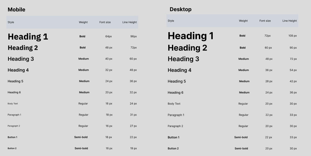
Typography: mobile and desktop type scale. Click to view full size.
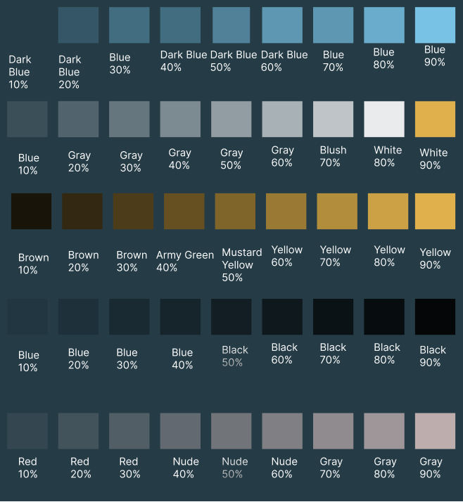
Color palette drawn from the brand. Click to view full size.
FIRST ITERATION
From wireframes to real screens.
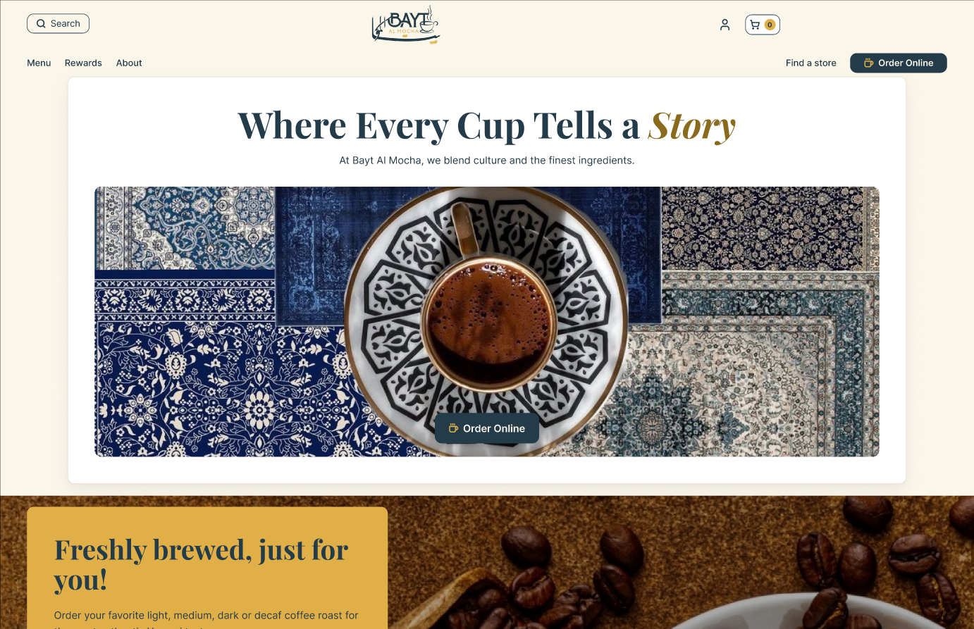
With the system in place, I built a responsive layout with breakpoints for desktop and mobile. Then I focused on making things easy to find.
Organized and described
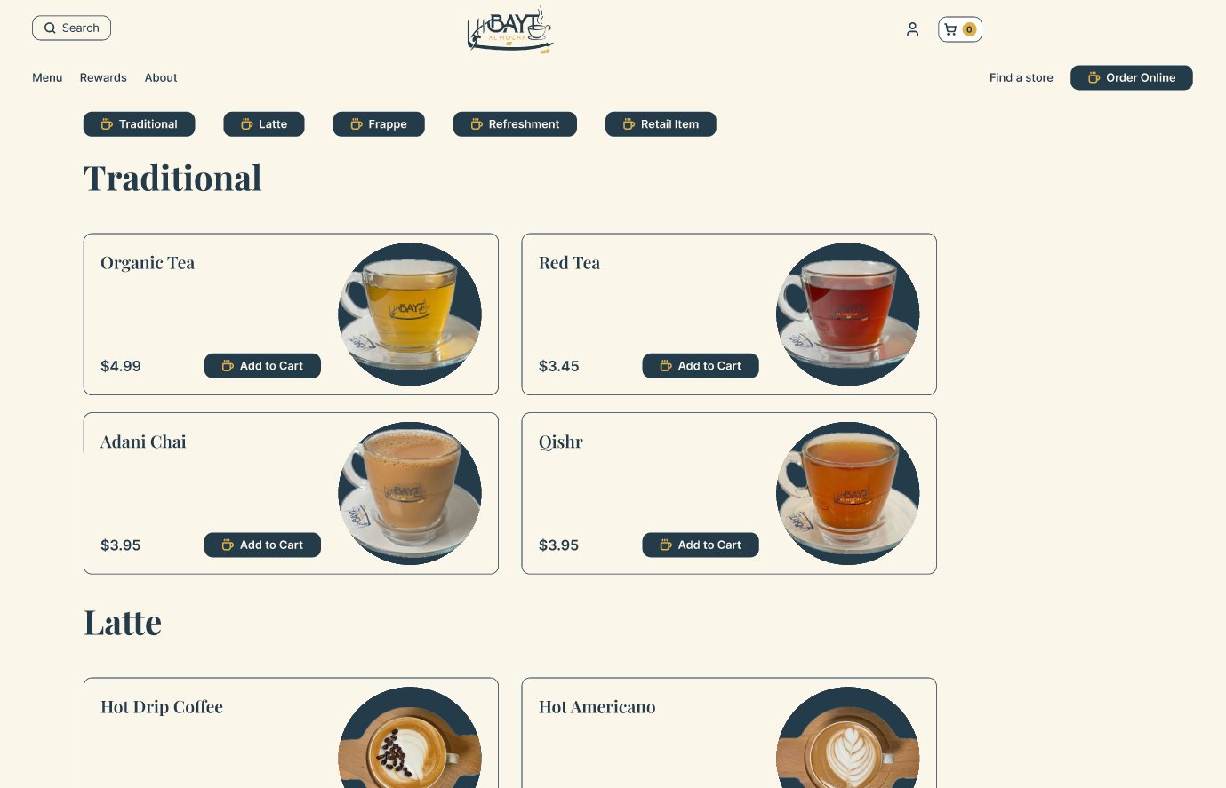
I grouped products into categories and added high-quality photos, detailed descriptions and tasting notes, so choosing a coffee doesn’t take guesswork.
Three simple steps
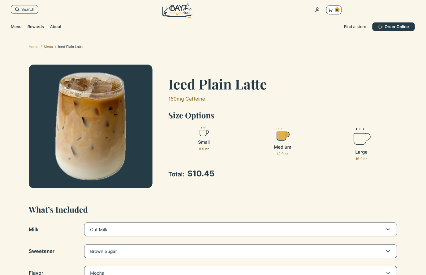
Navigation is now browse, customize, checkout, and it works the same on every device.
BUILT FOR PHONES
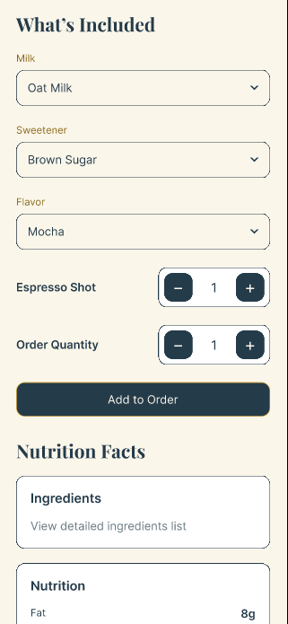
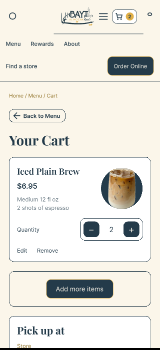
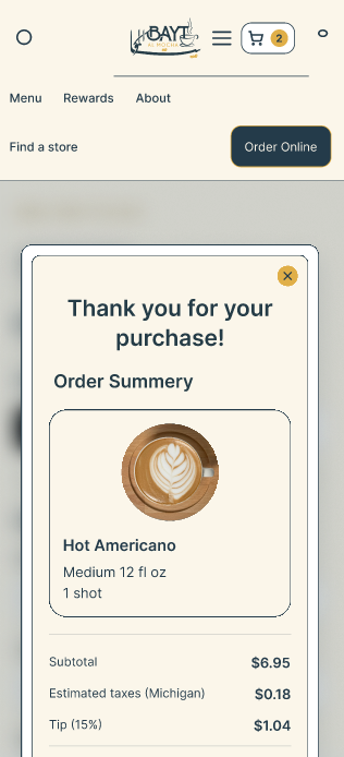
Most people order from their phones, so I made a phone version too.
Coffee orders happen on the couch, on the commute, in line. So I didn’t treat mobile as an afterthought. I designed a full phone version with the same three simple steps, bigger tap targets and readable type, so browsing, customizing and checking out feel just as easy in one hand.
USER TESTING
Then I handed it to real people.
Three participants tested both the original site and my prototype, completing the same tasks on each. I followed up with short interviews, then sorted everything they said into an affinity map. I wanted to see how easily people could browse, customize and check out, and how the two versions compared on efficiency, clarity and satisfaction.
Pick a drink
Find something to order.
Customize it
Make it your own.
Check out
Finish the order.
What I heard shaped my final round of refinements: clearer navigation, more readable text and a smoother overall experience.
REFLECTION
What this one taught me.
Brand details are usability details.
Colors, type size and consistency aren’t decoration. When they’re off, people trust the whole site a little less.
Organizing is half the design.
Sorting the menu into clear categories did more for the experience than any single visual change.