TL;DR
Responsive and Accessible Website for Cross-Country Coaching
In this in-class project with a real client, I designed and developed a responsive website for a local cross-country team. It gives coaches one simple, accessible place to view athlete information, race data and photo highlights.
THE PROBLEM
The team’s tools didn’t work on the device coaches actually use: their phones.
Coaches relied on static school pages, scattered spreadsheets, and emailed photos and race notes. None of it worked well on a phone, the main device at practices and meets. Parents also struggled with tiny text and low-contrast colors on the old site.
WHAT THE CLIENT ASKED US TO FOCUS ON
Five priorities shaped the whole project.
Each one started as a pain point with the team’s old tools, and became a goal for the new site.
ChallengePoor mobile experience
Work great on a phone
Coaches check stats and results from their phones at practices and meets.
ChallengeNot accessible for low-vision or motion-sensitive users
Be comfortable for everyone
High contrast, readable type, and reduced motion for users who need it.
ChallengeNo centralized athlete data
One place for athlete data
Athlete info and race results together, not scattered across spreadsheets and emails.
ChallengeHard to update or maintain
Easy to keep up to date
Simple enough for the coach to update without writing code.
ChallengeNo gallery or interactive visuals
Make photos the highlight
A gallery for the photos parents love to see, built to be accessible.
RESEARCH
What do coaches, athletes and families actually need?
I interviewed the client about how coaches use race data, what families and athletes want to see, where current tools fall short, and which accessibility needs the site had to meet.
Six things we heard
Phones first
Coaches check stats at meets.
Photos matter
Parents prefer photos to tables.
Contrast and size
Low-vision users struggled with small, pale text.
Easy updates
The coach edits without code.
Motion distracts
Animations bothered sensitive users.
Data overload
Race data overwhelmed small screens.
THE SOLUTION
Mobile-first, then scaled up for tablets and desktops.
01 · PHONE
Designed for the field first
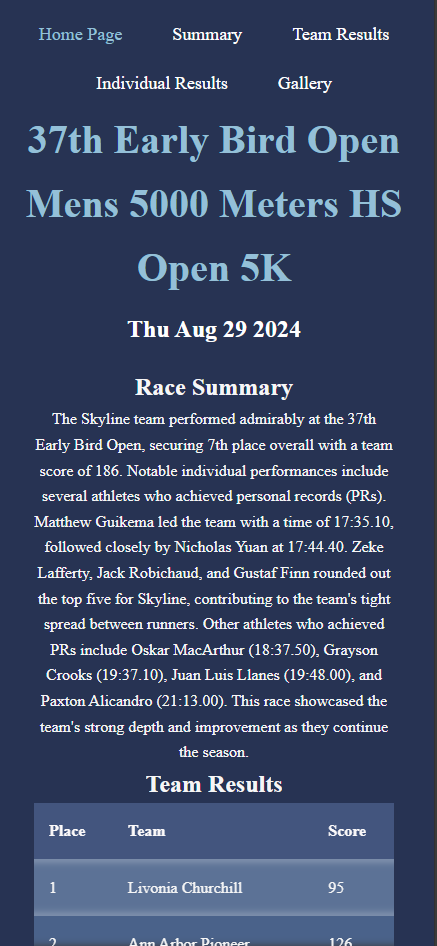
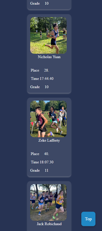
I started with phone layouts because coaches check stats and results on the field, in a hurry. Single-column, large tap targets, and the most important information at the top.
02 · DESKTOP
Then expanded, not redesigned
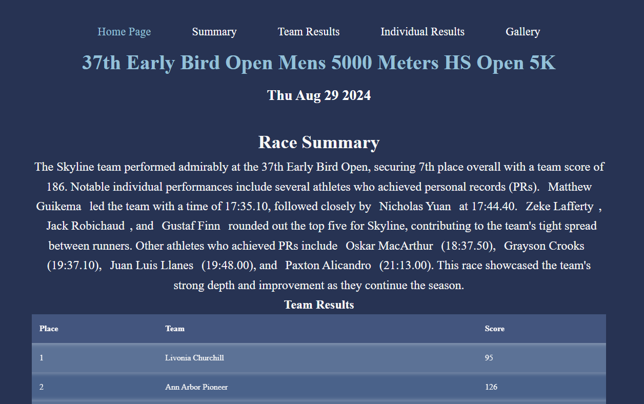
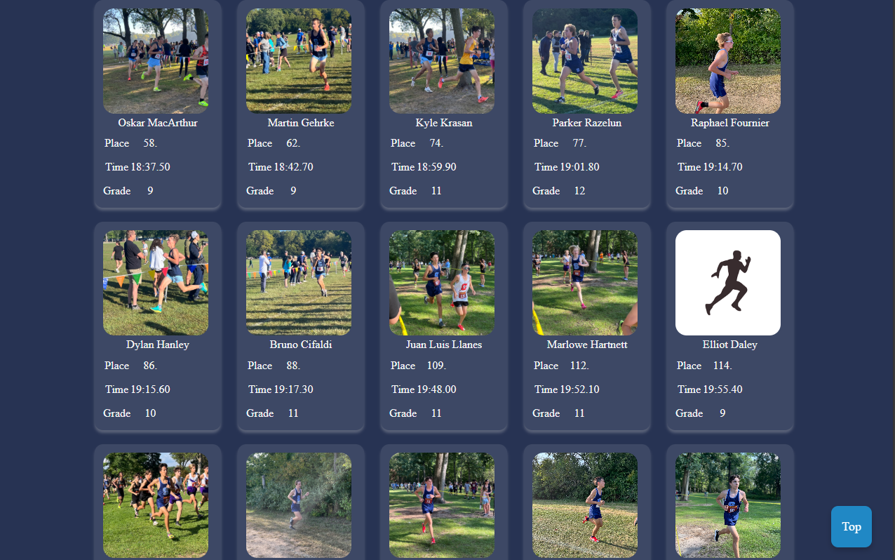
From there, the layout grows into multi-column grids, wider galleries and more visible data, without overwhelming anyone.
The same content and structure carry across every size, so the site feels familiar on any device.
Accessibility built in
- Keyboard-friendly with clear focus states
- High-contrast colors and readable type
- Respects reduced-motion settings
- Semantic HTML for screen readers
- Responsive on phone, tablet and desktop
DEVELOPMENT
Five build details that made it work in the field.
Built in HTML, CSS and JavaScript. Pick a detail to see how it works.
A bright, high-contrast theme chosen because coaches and families read the site in direct sunlight at meets, where dark screens wash out.
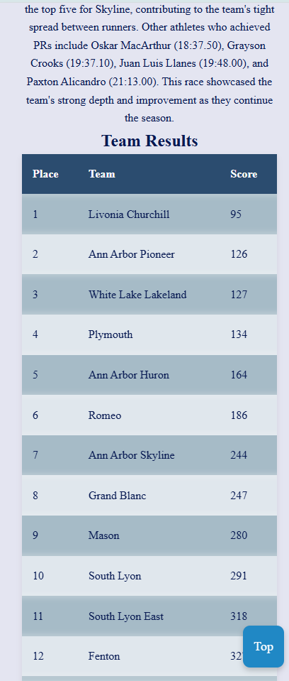
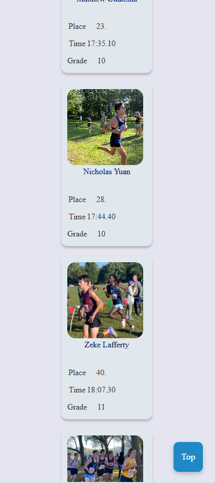
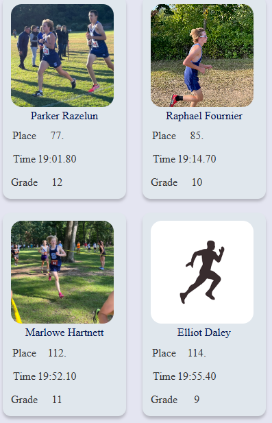
When an athlete’s photo isn’t available, a friendly default image appears so layouts never look broken or empty.
A “Skip to Main Content” link lets keyboard and screen-reader users jump past the navigation.
Appears on scroll and returns you to the top in one tap, so long athlete and results lists are easy to leave.

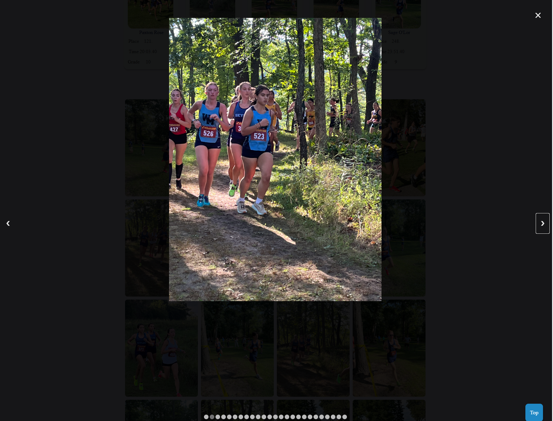
A highlights gallery with keyboard navigation and alt text on every image, built to work across screen sizes.
DEMO
See it in action.
A walkthrough of the cross-country coaching site.
LEARNINGS
What I took away from this project.
Accessibility works best when you start with it.
Because I coded everything from scratch, the hardest part was making things interactive without making them harder to use. I had to make the images and text responsive across all devices, and that took a lot of iterating. Planning for keyboards, contrast and reduced motion from day one was far easier than trying to patch them in later, and I now treat it as part of the design, not a final check.
Structure content so it can grow.
This was my first time coding a responsive interface from scratch while keeping a real client’s needs in view. It taught me to think about how content will scale before I think about how it looks.