TL;DR
An accessibility-first redesign that opens Comparative Literature to every user
For my SI 497 capstone, my team of three redesigned the University of Michigan Comparative Literature website for a client department. We studied how students, staff and a low-vision user moved through the site, then rebuilt its structure around tasks, accessibility and long-term maintainability within Adobe Experience Manager (AEM). In a side-by-side test, the redesign rated 4.9/5 for ease of use, up from about 3.8 for the original.
THE PROBLEM
Students can't easily find what's already on the Comparative Literature website.
Content is organized by department category, not by what people are trying to do, so program details, requirements, faculty and events are hard to find and scan. The site runs on AEM and LSA templates, so any redesign also had to be maintainable by staff. Solving this helps prospective and current students, and the staff who update the site.
RESEARCH
How do students, staff and assistive-technology users actually move through the site?
Before designing anything, we studied the existing site to understand how people found information, where they struggled, and what constraints shaped its content and upkeep.
Research questions
Six questions guided everything we did.
Navigation behavior
How do users navigate the Comparative Literature website to find key academic information?
Usability breakdowns
Where do users struggle with navigation, labeling, information architecture or visual hierarchy?
Accessibility
How do accessibility needs and WCAG-related issues affect usability across core pages?
Trust and credibility
How does the site’s structure and presentation influence users’ trust in the department?
Maintenance
How do faculty and staff update content in AEM, and what barriers make maintenance challenging?
Design direction
What design improvements could make the site more intuitive, accessible and easier to maintain?
Research methods
Each method examined a different part of the experience.
Where do students get stuck?
01 / 05Moderated, think-aloud sessions on the current site. We logged first clicks, errors, hesitation and a 1–5 ease rating per task.
Sample session A · desktop
Sample session B · mobile
Dots show the 1–5 ease rating for each sample session.
How accessible is the site, really?
02 / 05Axe DevTools, WAVE and manual checks of contrast, headings, ARIA, keyboard order and screen reader sequencing.
What does the site feel like with text-to-speech?
03 / 05A semi-structured interview with a low-vision user who navigates with text-to-speech and is learning NVDA.
“I can’t just go to the website.”
Low-vision screen reader user
What makes the site hard to maintain?
04 / 05Interviews with the people who update the site in Adobe Experience Manager, covering workflows, duplication and accessibility confidence.
How do peer departments solve this?
05 / 05We reviewed peer LSA and university department sites, then gathered what worked into shared boards for the team to react to.
WHAT WE LEARNED
The problem wasn’t missing content. It was structure.
Users found what they needed when labels were clear and pathways were shallow. As pages got deeper and denser, usability, accessibility and maintenance all got worse together.
Navigation broke down on deeper pages
Users could start from the main navigation. But subpages and side menus offered several possible paths, which led to hesitation and trial and error.
Weak hierarchy hid what mattered
People followed what stood out, not what was relevant. The People page filter, PhD coursework requirements and upcoming events were all easy to miss.
Built around roles, not tasks
The site is organized by audience, like undergraduate and graduate. But people arrive with goals, like finding requirements or faculty, and have to guess where their task fits.
Accessibility failures were systemic
Audit results matched what the low-vision participant experienced: low contrast, inconsistent headings, and links that relied on color alone.
Contact info was expected, but hidden
Most people scrolled straight to the footer. Contact was also nested under About Us, which many didn’t expect, so it felt hidden.
Staff were stuck maintaining it
Content managers described duplicated pages, outdated items, and a steep AEM learning curve, all made worse by dense, layered layouts.
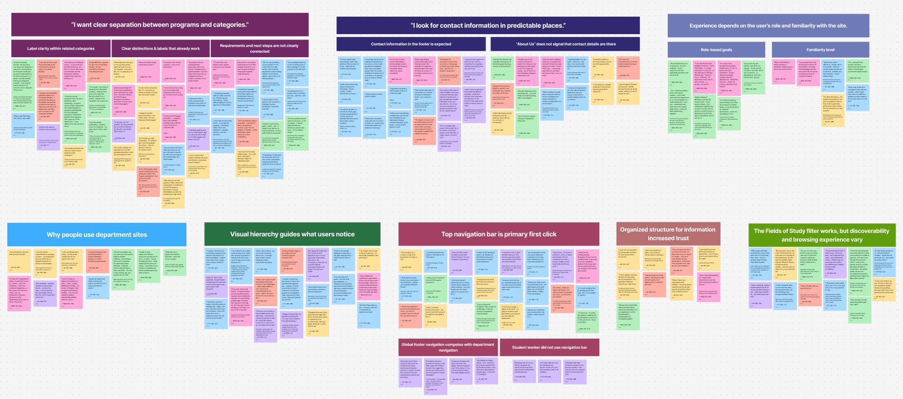
How we synthesized it
Interview and test notes grouped into themes on an affinity diagram.
THE PROCESS
How should a site be organized if people arrive with goals, not job titles?
Our first instinct was to organize pages by audience. But people arrive with goals, like exploring programs or finding a faculty member, and when we shared early versions with the client, they flagged the same information repeating across pages. So we kept Prospective and Current Students as entry points and shared the deeper pages, so a single PhD Program page serves both audiences. The interaction flows below trace these paths, from exploring undergraduate and graduate options to filtering the People directory. The result is a structure that stays clear for users and is easier for staff to maintain.
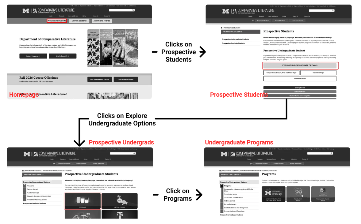
Prospective undergraduate flow. Click to view full size.
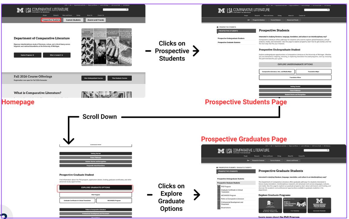
Prospective graduate flow. Click to view full size.
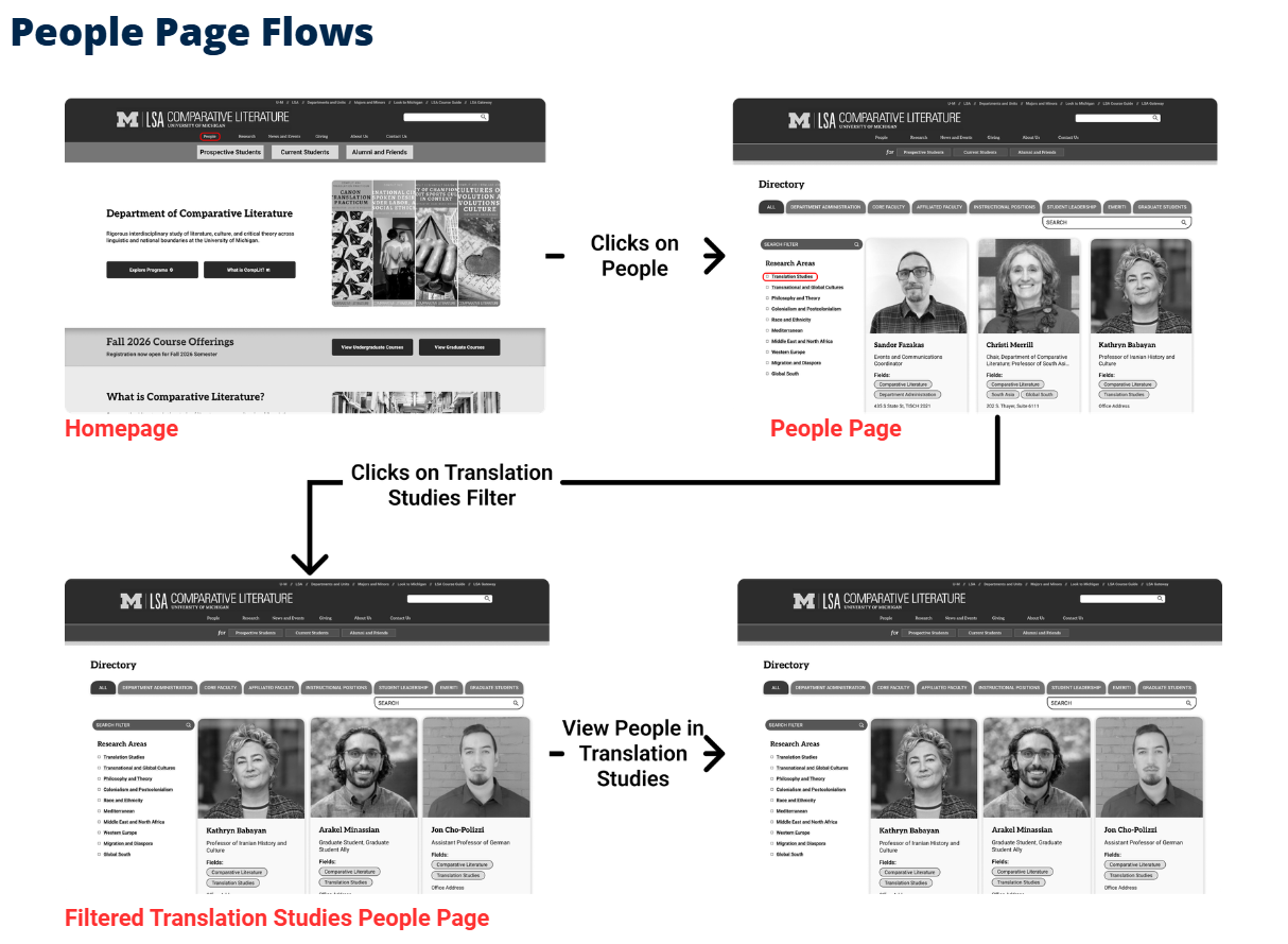
Filtering the People page. Click to view full size.
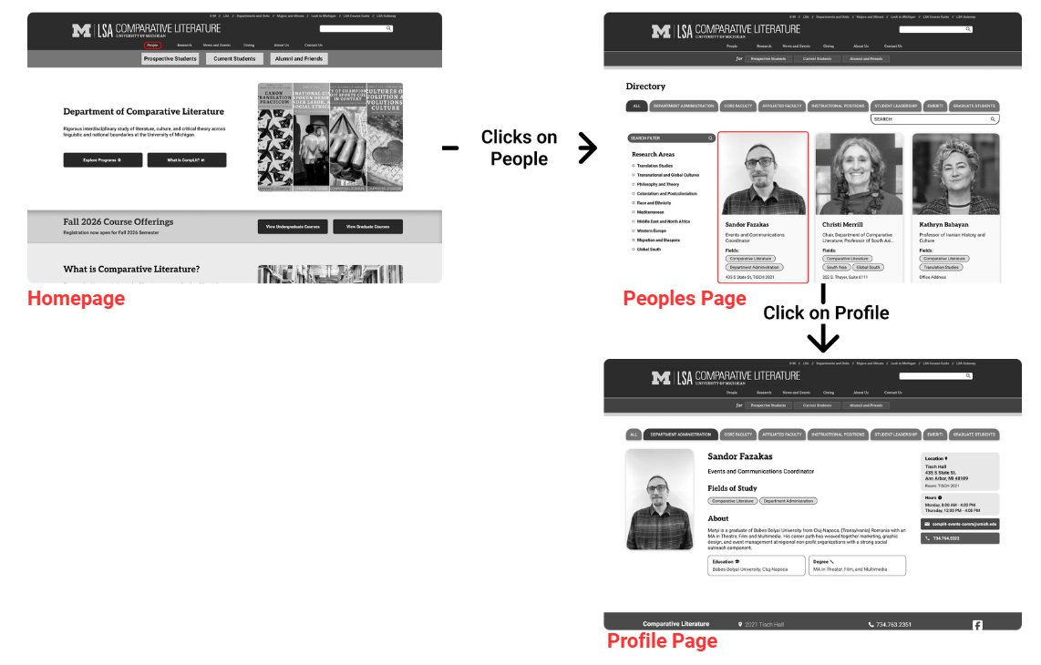
Opening a profile. Click to view full size.
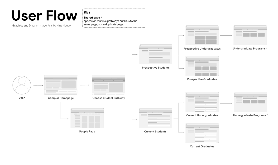
User flow. Click to view full size.
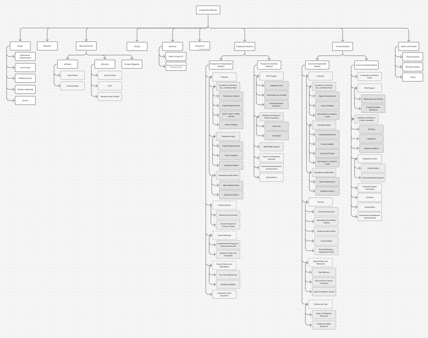
The full IA map. Click to view full size.
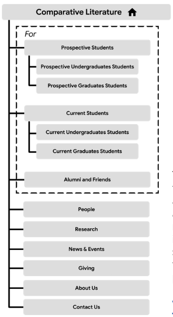
A simplified top-level IA
EXPLORING THE PEOPLE PAGE
How do you help people find a faculty member without scrolling a dense list?
The original page had low contrast, weak spacing and a hard-to-spot filter. We moved to cards with a visible filter and search, plus a clear “Full Profile” button.
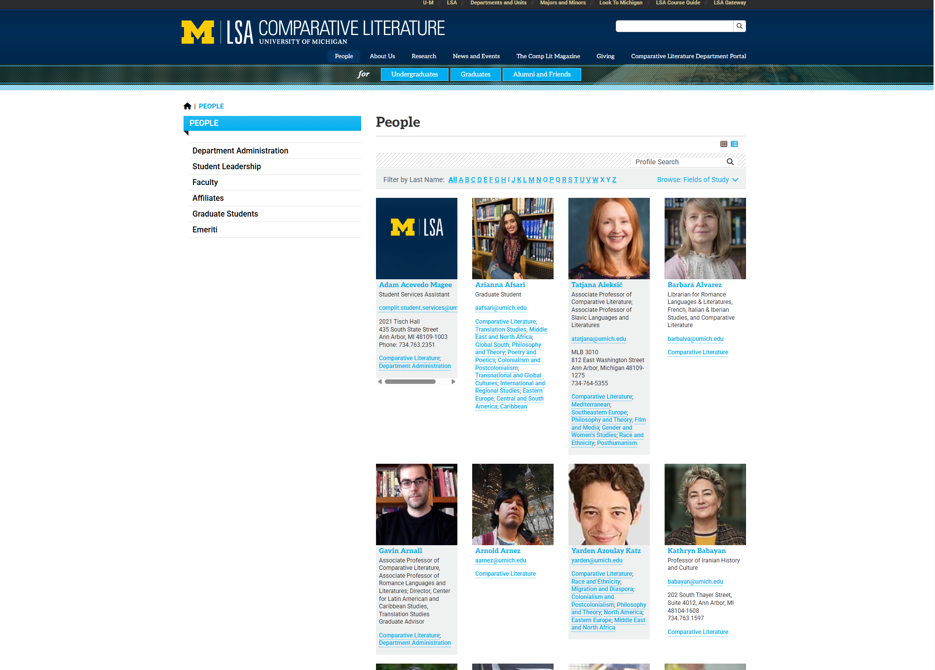
Original People page. Click to view full size.
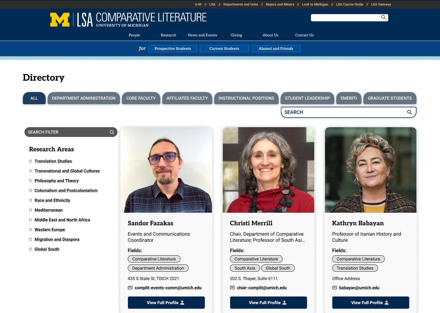
Redesigned People page. Click to view full size.
EXPLORING NEWS & EVENTS
Why were news and events fighting each other for attention?
They shared one dense layout, so upcoming events got “overshadowed by the news.” We separated them. News became scannable cards with an archive, and events were organized by timeframe.
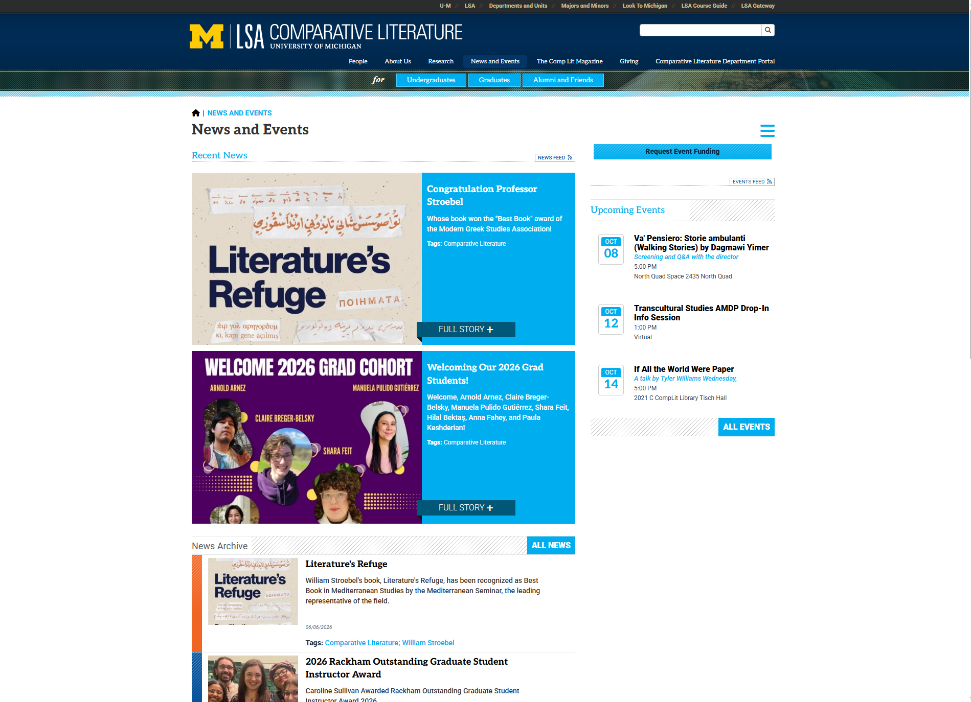
Original News & Events page. Click to view full size.
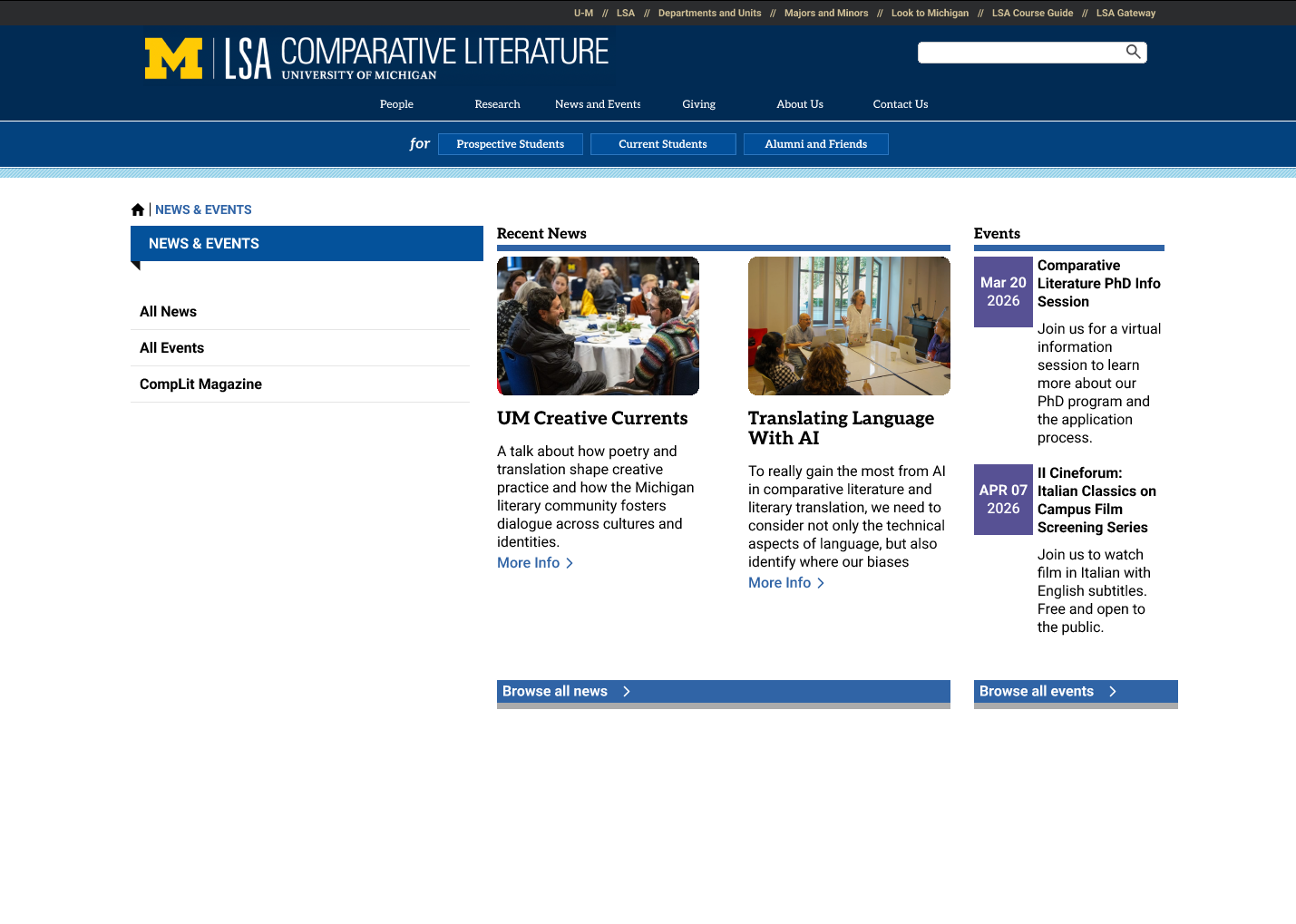
Redesigned News & Events page. Click to view full size.
THE SOLUTION
A task-first site built to fit AEM.
We rebuilt the structure and the key pages:
- Homepage: a focused hero and modular sections.
- Entry pages: separate Prospective and Current Student pages.
- Program pages: degree requirements lead with credits, core courses and the capstone.
- People: cards with a visible filter and search.
- News & Events: separated.
- Throughout: higher contrast and consistent headings, designed to follow U-M style and WCAG.
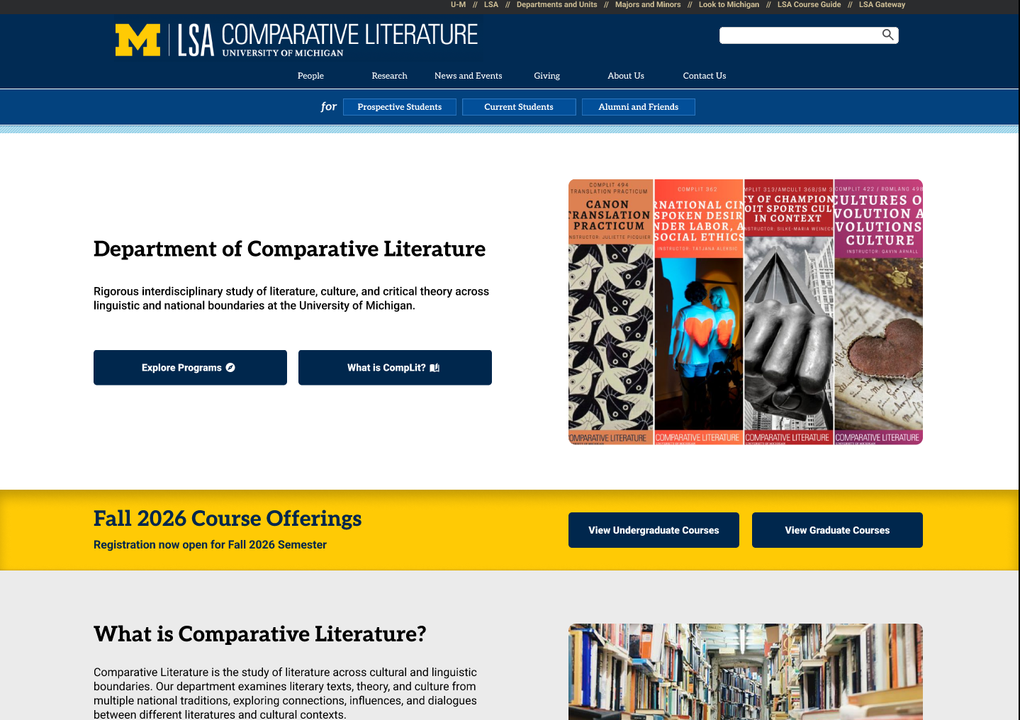
Homepage. Click to view full size.
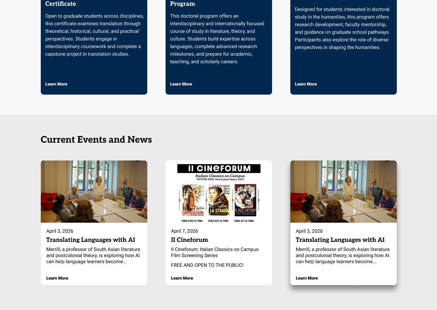
Homepage: programs and current events. Click to view full size.
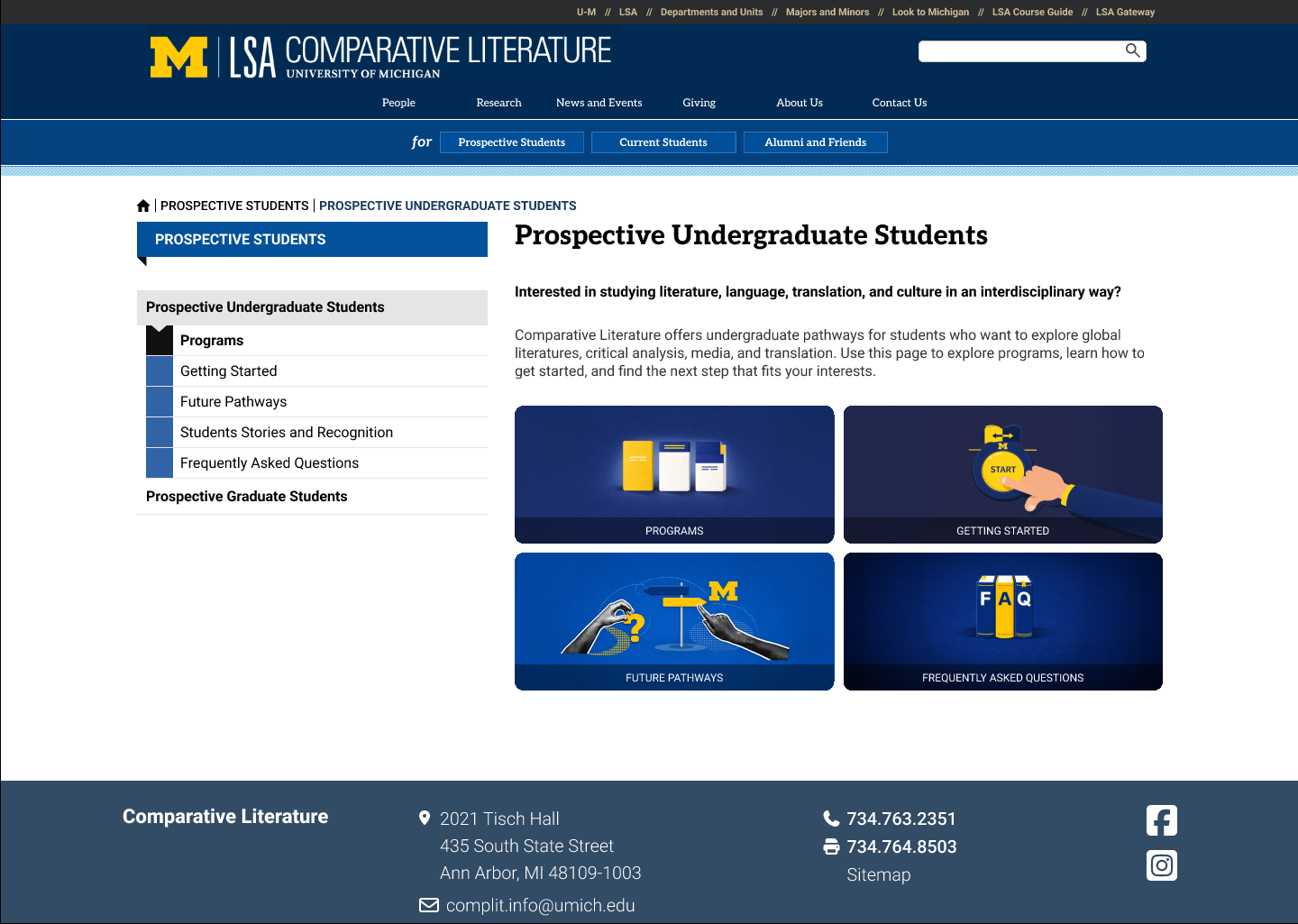
Prospective Undergraduate Students entry page. Click to view full size.
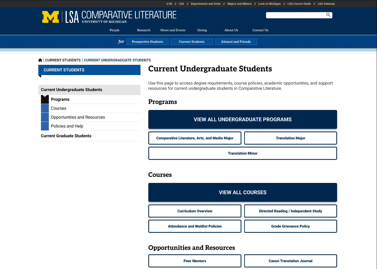
Current Undergraduate Students entry page. Click to view full size.
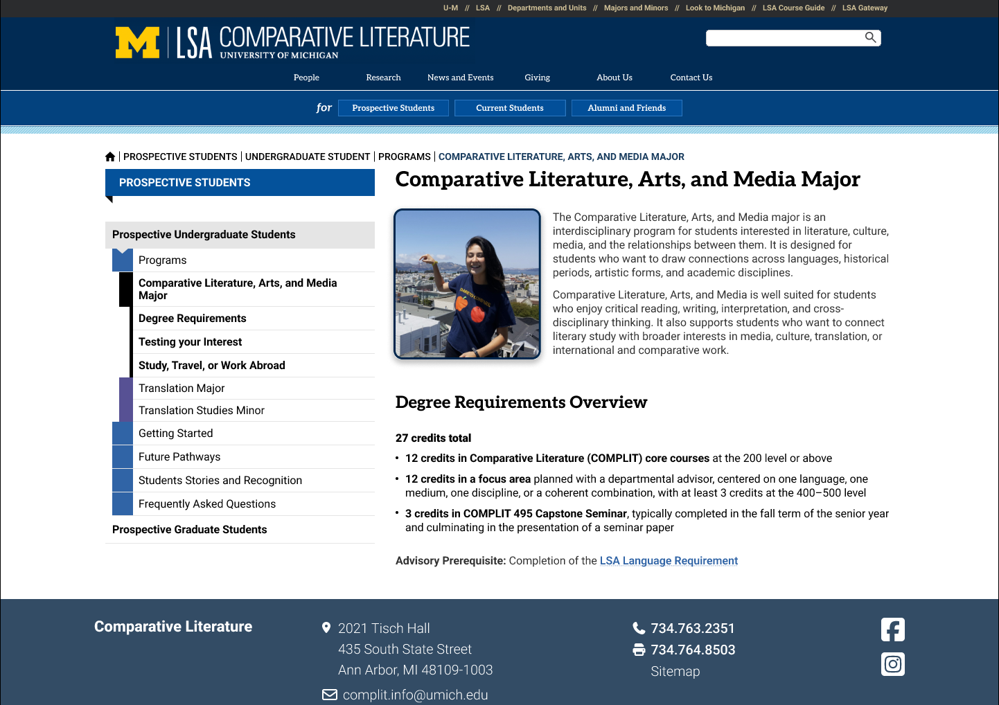
Major page. Click to view full size.
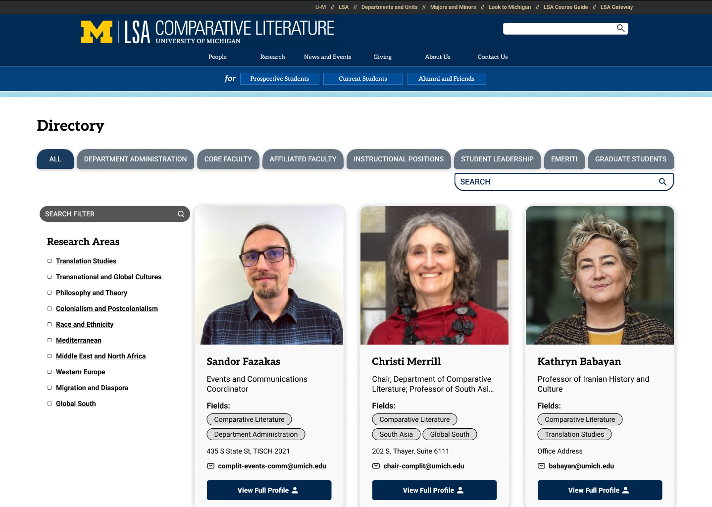
People directory. Click to view full size.
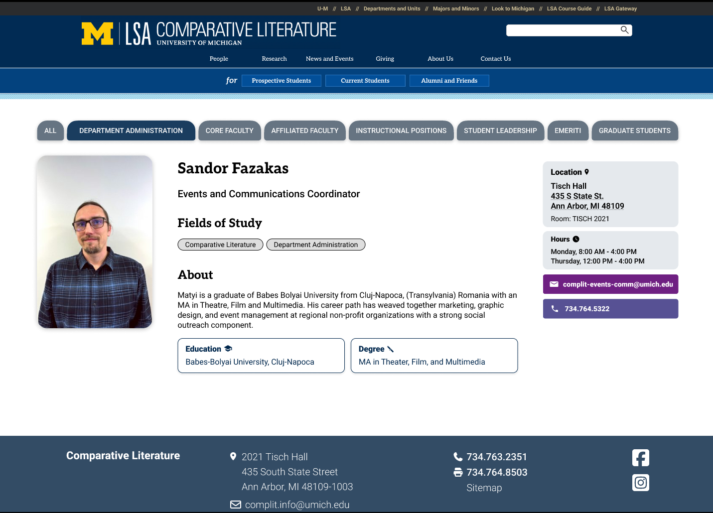
Profile page. Click to view full size.
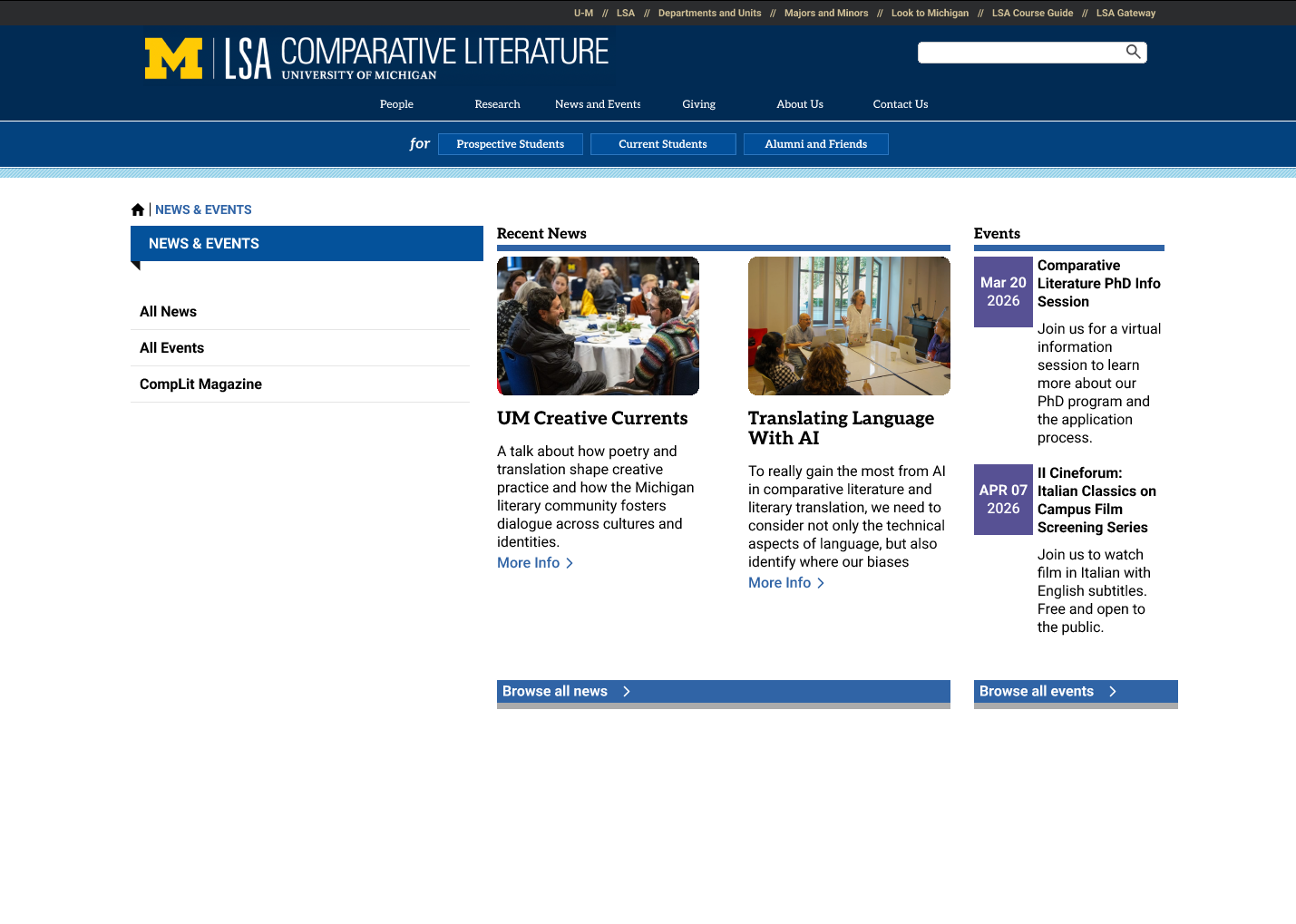
News & Events. Click to view full size.
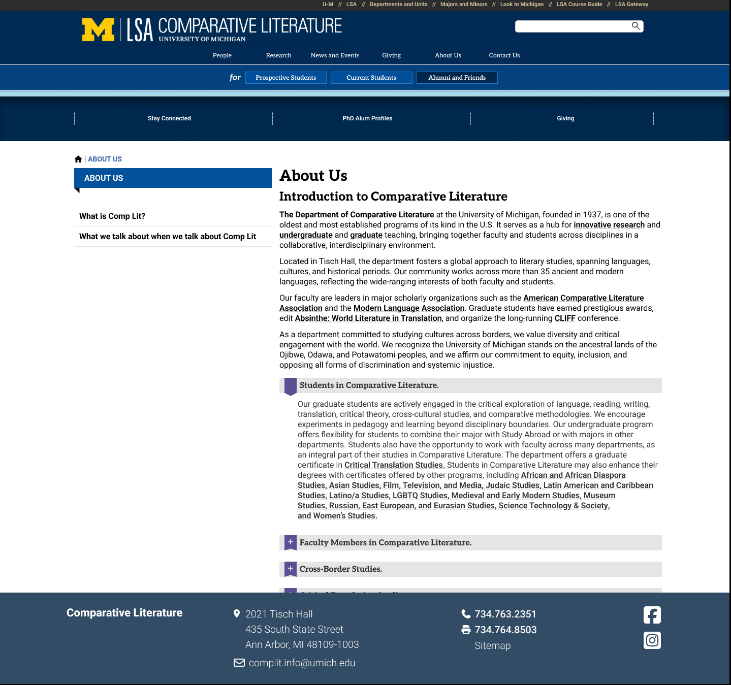
About Us. Click to view full size.
EVALUATION
Did the redesign actually make things easier?
We tested the original site against the prototype with 5 participants (3 students, 2 alumni). Each did the same five tasks on both versions, in alternating order. Average ease ratings rose from about 3.8 to 4.9 out of 5. Finding graduate program and funding info improved most, from about 2.2 to 4.6.
What we’d refine next: centralize graduate content in one consistent layout, tone down the People category bar, and reposition events.
LEARNINGS
Key Takeaways
Structure matters more than polish.
Every method pointed to the same conclusion: people didn’t need more content, they needed clearer paths to it.
Design for the people who maintain it.
Client feedback pushed us to share pages instead of duplicating them. A good structure has to work for visitors and for the staff updating it.